

.png?width=300&name=Mobile%20view-01%20(1).png)
.png?width=5000&name=Mobile%20view-01%20(1).png)
We all know that email marketing is important, and as brokers, it's the number one way you stay connected with clients. It's where your client is looking for information from you on the next new listing or open house, where you confirm appointments, maintain your client relationships, and share the final documents to close the deal. With all the business we conduct over email the big question is, what does your email look like when you send it to your clients? Is it easy to read and engage with for each client on their desktop AND mobile device?
When creating your marketing material, you want it to look great and get it out the door. The thing is, few of us spend our time thinking how it looks on a mobile device once we're nearly done with the design. If it's good in desktop view, that's sufficient enough right? Not so much.
Recent surveys have indicated that 68% of emails are being viewed from a mobile device and 31% of those individuals said their smartphone is their primary device to make transactions. As a broker or marketer, this is something to stop and take note of. Each time you've created a marketing email, did you create it with the mobile view in mind? With the majority of people viewing emails on a mobile device, I would recommend you build your email designs from the mobile version first before the desktop.
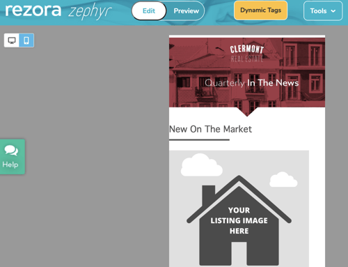
Cue rezora's new mobile editing feature! We recently implemented the option to build and edit templates and marketing pieces from the mobile view. You no longer need to preview back and forth to see the mobile view and then go back into edit mode. Now you can click which view to edit in and you're set! Next time you're in rezora editing a marketing piece or template, just mouse up to the top left of your screen and you can select the smartphone icon to change your view and edit.
With that said, next time you start building your email from the mobile view here are some tips to keep in mind.
Tip #1 - Use a Single Column Layout
When it comes to building your layout design, the options are truly endless. However, when you're thinking of customers viewing the email on their mobile device using a single column is the best way to go. You want your email design to be mobile responsive, meaning it will adjust to different devices and their sizes to maintain the integrity/style of the email. With one column on mobile this is the best to maintain a responsive marketing piece since the device only has to adjust for one column versus trying to squeeze in and push images or text down onto another line to fit on the screen.
Certain devices like Apple are set up to be more adaptable when it comes to mobile view however there are many other smartphones and tablets that are not and what looks great to one person could look like an unorganized mess to another. Which of course makes them uninterested and doesn't give a clear direction on what message is being delivered.
Note: Single column layouts are best viewed at 600-640 pixels on mobile. They are easier to read and if the email needs to adjust in the smaller device, it will do a better job of adapting if you're no wider than 640 px.
Tip #2 - Keep it Simple
There are a lot of beautiful email marketing designs out there and many you see have multiple columns and unique designs, videos, etc. This works great in a desktop view but when it comes to viewing on a mobile device, the screen is much smaller, giving you less space to capture your customer and have them engage with you.
It's best to be clear and direct in your message. As soon as your customer opens up the email you sent you want to immediately share the value in the email. Think like your customer - what information will they care about most? Give it to them or have an easily identifiable way for them to get what they are looking for. I don't recommend making them scroll through the email too far to set up a showing for a new listing.
This is good practice in approaching your messaging in general, but it is imperative when you are working with a small space. It just takes one quick thumb movement for them to move on if the information they're looking for is not there.
Tip #3 - Allow Room for Fingers and CTAs
It's important to remember that when users are viewing from a mobile device their fingers are always in motion and when there isn't enough space between a button and linked text for example, it's easy for someone to accidentally click on the wrong link. To avoid this, make sure to build your marketing piece with plenty of padding around your links and CTA (call to action) buttons.
It's recommended to allow for about 20-30 pixels around the border of the email for users to hold the device and then pad space in between a button or link by 10 pixels.
With that said, be sure to include CTA's, buttons, and links that guide your audience where you want them. Keep the links relevant; if someone clicks on an image of a house, it should not go to your homepage of your website, but to the listing page or gallery.
Tip #4 - The Subject Line = The First Impression of Your Business
Subject lines are like trying to figure out what the title of your short story should be when you were in school, or me trying to figure out what to title this blog post. You want it to sound good and grab attention but you don't want it to sound cheesy or have ALL CAPS with a ton of !!!!!!! This type of subject line will get your email moved straight to trash, junk, or the dreadful spam folder.
So what should your subject line be? A short description of what information your email is about. If you're providing information that the recipient is interested in, you'll want it to be easy for them to find again. A subject line that says IMPORTANT READ ME doesn't tell the reader what it's about and feel overwhelming with the rest of the messages in their inbox.
Much like your email, the subject line should be simple and concise and tell the recipient exactly what you want them to know.
Tip #5 - Be Mobile Friendly Beyond Email
Now that you've put all your thoughts into how you're going to build your next mobile friendly email, remember to have a mobile friendly website you're leading clients to. Once you get someone to open and click on your email, you're not in the clear just yet!
Your website or wherever you are directing your customers should be mobile friendly too. If 68% of people are viewing emails on mobile, then they are definitely visiting websites on mobile as well. Having a website that is not set up to be mobile friendly is a guaranteed way to lose that potential client.
Now it's time to get started. Remember to try creating your marketing pieces in the mobile view first next time, and watch your response rates go up!
